


Color plays a vital role in shaping the ambiance of any space, impacting both its aesthetic appeal and the emotions of those who occupy it. By understanding color psychology, you can choose the right shades to evoke the mood you desire—whether that’s calm, energy, or inspiration. In this blog, we explore how different colors influence the atmosphere of your home and how to effectively apply them to various spaces.
1. How Colors Affect Emotions
Colors have a powerful psychological impact, triggering a wide range of emotions. Some hues are calming, while others stimulate activity and creativity. The key to using color effectively in interior design is recognizing these emotional responses and applying them thoughtfully.
Red: Passion and Energy
Red is a bold and dynamic color, often associated with warmth, intensity, and excitement. It’s ideal for spaces like living rooms, kitchens, and dining areas, where energy and activity are encouraged. However, because red can be overstimulating, it’s best to use it sparingly to avoid feelings of aggression or anxiety.
Blue: Calm and Trust
Blue is known for its calming effect, making it a popular choice for bedrooms and bathrooms. It helps create a serene environment, promoting relaxation and restful sleep. Additionally, blue is linked to trust and professionalism, making it a good option for home offices or study areas.
Yellow: Happiness and Optimism
Yellow, the color of sunshine, brings warmth and cheer to any space. It’s perfect for kitchens, entryways, and social areas, where it encourages conversation and positive energy. However, too much yellow can feel overwhelming, so it’s best used in accents or as a secondary color.
Green: Balance and Freshness
Green, associated with nature, promotes balance and renewal. It’s a great choice for living rooms, offices, and bedrooms, helping to create a peaceful, grounded atmosphere. Green also enhances creativity and focus, making it a fitting choice for workspaces where mental clarity is essential.
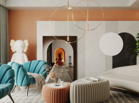
Orange: Creativity and Enthusiasm
Orange is a lively, energetic color that stimulates creativity and enthusiasm. It works well in home offices, kitchens, or playrooms, where it fosters conversation and mental energy. Like red, however, it should be used in moderation as it can become overwhelming when overused.
2. Warm vs. Cool Colors in Interior Design
When selecting colors for your space, it’s important to decide whether you want warm or cool tones, as each creates a different mood.
Warm Colors
Colors like red, orange, yellow, and brown are considered warm. These tones bring warmth and intimacy to a room, making them perfect for areas where people gather, such as living and dining rooms. They create a cozy, welcoming environment and are especially effective in cooler climates.
Cool Colors
Cool colors—such as blue, green, and purple—are known for their calming and relaxing effects. They work well in spaces like bedrooms and bathrooms, where relaxation is key. Cool tones can also make a room feel larger and more open, making them ideal for smaller spaces or rooms with limited natural light.
3. The Role of Lighting in Color Perception
The lighting in a room can significantly alter the way colors appear. Natural light, artificial lighting, and the type of bulbs used all influence how a color looks in a space. For example, soft, warm lighting can make a cool-toned room feel cozier, while fluorescent lights can make certain colors, like yellow or red, appear harsh or overly bright.
When selecting colors, consider how much natural light the room gets. Rooms with limited sunlight benefit from cooler tones that reflect light and brighten the space, while well-lit rooms can handle richer, darker shades without feeling too enclosed.
4. Color Psychology in Different Rooms
Each area of your home serves a unique purpose, and choosing the right color for each space will enhance its function.
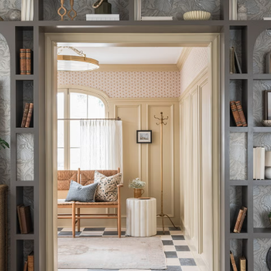
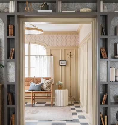
Living Rooms: Warm and Inviting
The living room is often the gathering place for friends and family. To encourage warmth and connection, choose colors like soft reds, yellows, and oranges. For a more relaxed atmosphere, blues and greens work well. Neutral tones, like beige or taupe, provide a versatile base, allowing you to add pops of color through accessories.
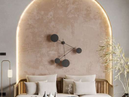
Bedrooms: Peaceful and Restful
Your bedroom should be a sanctuary of relaxation. To promote calmness and better sleep, opt for soft blues, greens, and muted purples. Avoid bright or overly bold colors, which can be too stimulating and disrupt restfulness.
Kitchens: Energizing and Functional
The kitchen needs to strike a balance between energy and practicality. Warm colors such as reds, oranges, and yellows stimulate the appetite and create a welcoming environment. For a more modern aesthetic, go for neutral shades with accent colors, or add touches of green or blue for a calming yet inviting effect.
Home Offices: Focused and Productive
For a home office, choose colors that promote focus and creativity. Soft blues, greens, and grays create a balanced, peaceful environment conducive to concentration. You can also introduce a hint of yellow or orange to add a burst of mental energy without overwhelming the space.
5. Harmonizing Color Combinations
While using multiple colors in your design can create depth and visual interest, it’s essential to find the right balance. Too many contrasting colors can create chaos, while too few may make the room feel flat.
To achieve harmony, use complementary colors—those opposite each other on the color wheel, such as blue and orange—or analogous colors, which sit next to each other, like blue, green, and turquoise. Combining these thoughtfully can result in a visually appealing and well-balanced space.
Conclusion
The psychology of color in interior design is more than just about picking pretty shades. By understanding the emotional effects colors have on our mood, you can create spaces that are not only visually appealing but also enhance your well-being. Whether you want to energize a room with vibrant hues or create a calm retreat with softer tones, every color has a unique power to influence the atmosphere of your home.
By thoughtfully applying color psychology, you can design spaces that align with your lifestyle and emotional needs, making your home a place that feels as good as it looks.